Using charts, it is possible to express data of various types and sizes from several data points to large-scale multivariate data sets.


Bar

Line Chart

Pie

Area

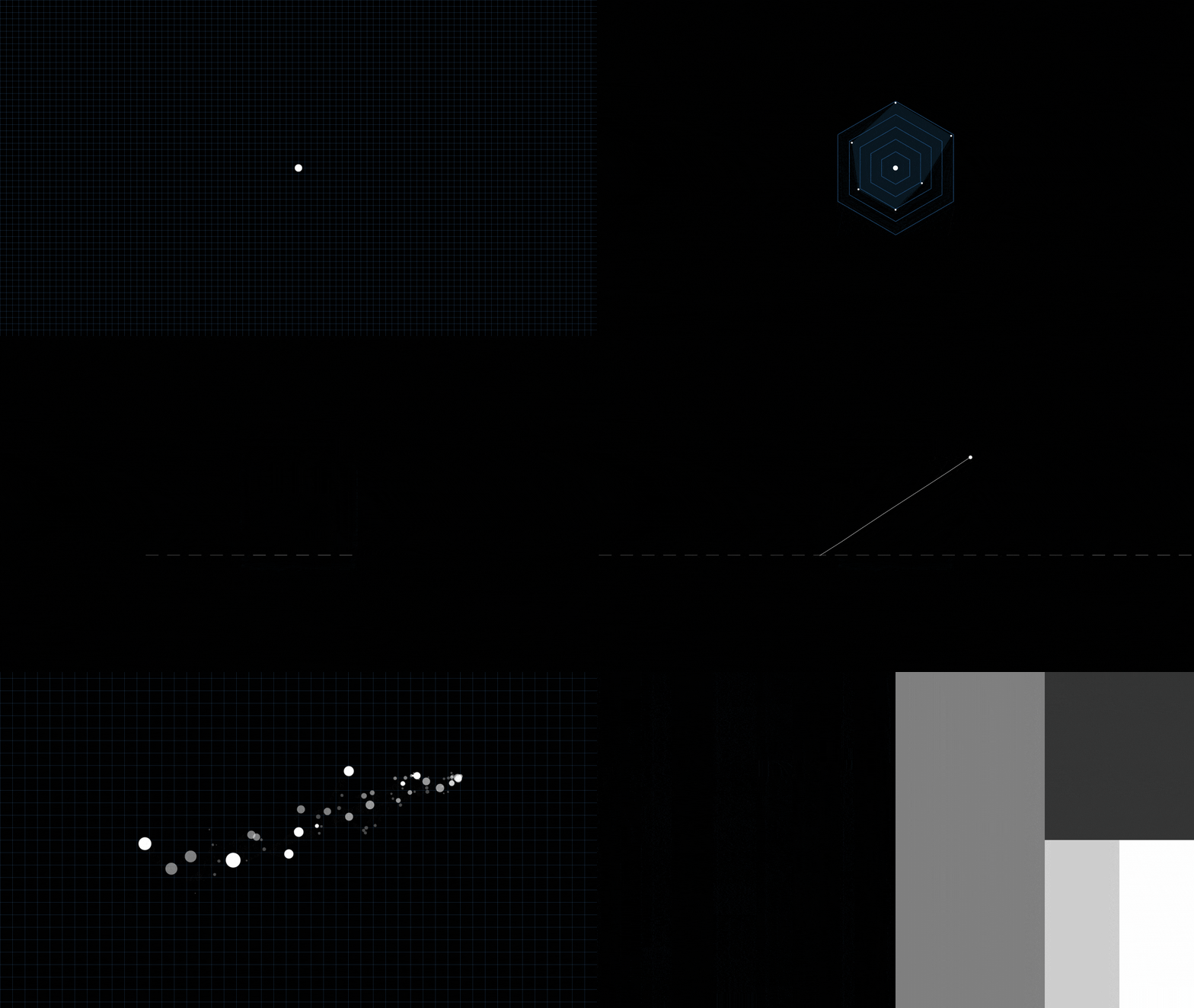
Scatter

Radar

Tree Map

Geospatial Maps
They also are used to display the comparison between trend data and various data sets side by side.


Bar Chart 01
Bar charts are useful for organizing several data series and presenting trends following time.

Bar Chart 02
Lines are used together sometimes for better understanding of graphs.
They are used to show trend data or compare two or more data information.

Line Chart 01
Broken line charts are useful for presenting charts containing several data series and trends following time.

Line Chart 02
Multiple broken line charts show the relation between the independent and dependent values in multiple data sets.
The arcs of each segment show the proportional values of each piece of data.

Pie Chart
In a pie chart, the length of the arc (the central angle and area) of each piece is proportional to the amount represented by the piece.

Donut Chart
Doughnut charts are used to display proportions of categorical data, in which the size of each piece represents the proportion of each category.
Area charts are distinguished from line charts by adding a shade between a line and a baseline like bar charts.

Area Graph 01
Area charts are useful for emphasizing the change size following time.

Area Graph 02
Cumulative area charts also are used to show the relationship of parts to the whole.
The position of each point on the horizontal and vertical axes show the value of an individual data point.
Scatter graphs are used to observe the relationship between variables.

Scatter Chart 01
Using a scatter graph, the correlation between the horizontal and vertical axis can be found.

Scatter Chart 02
Using a scatter graph, the correlation between multiple measurement values can be found.

Radar Chart 01
Radar Chart 02
Radar Chart 03
Radar charts are convenient to stack various measurement targets together and compare them, and to intuitively figure out not only the proportion between each item, but also the balance and trend.
The space of visualization is divided into rectangles whose size and order have been specified by quantitative variables.

Tree Map 01

Tree Map 02
In the visualization of a tree map, the largest rectangle is placed in the top left corner and the smallest in the bottom right corner.

Geospatial maps are frameworks which collect, manage, and analyze geospatial data or ground data.